Making an Art Book with Monica Garwood
Monica Garwood is an illustrator, designer, letterer, painter etc. born and raised in the Bay Area. She graduated from California College of the Arts with a BFA in Illustration and a minor in Visual Studies. She currently lives and works in San Francisco.
I’m an illustrator, painter, and designer from San Francisco, California. I mainly work in watercolor, and my paintings are all different sizes, from 2×3 inches to 24×36 inches, so I can never really look at them or show them at the same time. I get asked all the time to make a collection of my paintings and sell it; I think my followers want to view my art in a more tangible way and at a bigger size than a smartphone screen. So when Blurb asked me to create and self-publish a book of my art, it seemed like the perfect opportunity and I couldn’t be more excited.

Like with most new artistic projects, once I prepared to actually begin, the excitement briefly turned to momentary panic. To design a whole book is surely a big task, and even though I knew I could use pre-made layouts that Blurb provides for free, I like to have control over every aspect, so I chose to use Adobe InDesign. I was dreading creating all the templates in InDesign (it’s always tedious measuring out and setting up page size, bleed size, trim size, safe area guides, gutter, etc.). Luckily, once I got to the Blurb website, I saw that there is a Blurb plugin for InDesign with pre-made templates that have all the guides already set up! Which meant I all I had to do was the fun stuff: font choice, laying out artwork, and ordering pages for a good flow. The whole design took less than a day, and the plugin lets you export and publish right from InDesign.
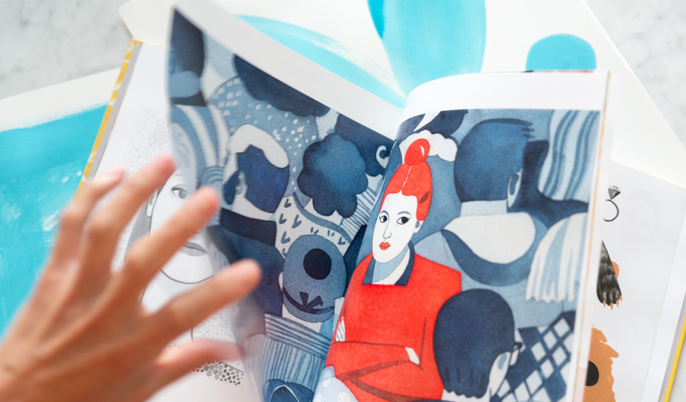
I knew right away I didn’t just want to make a printed version of my Instagram; I wanted to provide viewers with something extra. So some pages, I created new designs or collages of previously unpublished work. I included behind the scene and process shots, and super macro up-close detail of some paintings, which shows all the little imperfections (happy accidents) and textures you can’t see on a screen. I also included an interview in the back and shared all my favorite materials and brands for those who want to geek out on art supplies.
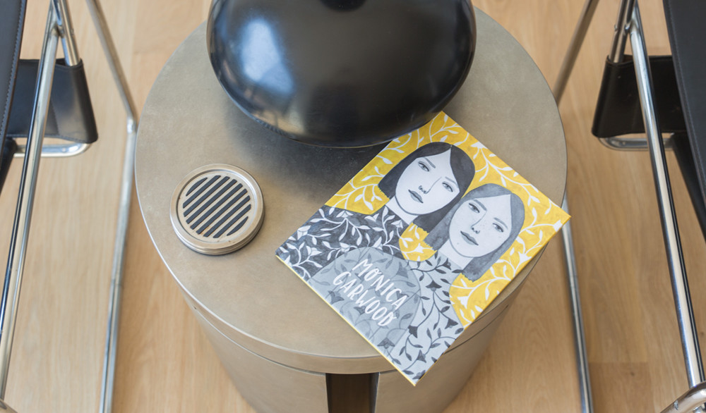
I loved how many options I had for this book, so I could truly personalize it. I had a choice of softcover, hardcover + dust jacket, or hardcover ImageWrap. I chose hardcover ImageWrap because I love the durability of hardcover and I often lose dust jackets. I received samples of the different paper options and loved the soft texture, slight sheen, and substantial thickness of the Premium Lustre. Lastly, I chose size: I went with standard portrait size at 8×10 inches.

When the book arrived, my first impression was how unbelievably professional looking it is. I couldn’t believe this was something I made and could have bought from a bookstore. The ImageWrap cover is super thick, seamlessly crafted, and makes the whole book look high-end. I opened the book up and was so happy with how much these reproductions looked like my original art. The printing quality is so high; every color looks super saturated and rich. My paintings look so crisp, and every little detail can be seen. It’s difficult to find a printer that can successfully reproduce the texture, gradients, and softness of watercolor, but it’s all here.
I loved the process of curating my own little gallery into a book. It’s the perfect thing to bring when I give talks to students, to conventions, when I’m meeting with an art director, and for my followers who want to see my work more in-depth. Being face-to-face with a high-quality, true-to-color, printed book that captures every texture and detail of my paintings is truly satisfying, and I can’t wait to share it with the world.


This post doesn't have any comment. Be the first one!