
Book Layout & Design Ideas: Layout 8
This blog series aims to provide some basic book design ideas for your photo books, magazines, and other book formats. The spreads you see here, and the added notes, are not meant to be reflections of perfect book design or book layout, only a baseline from which to begin your own book journey
Layout 8
I don’t believe there is a perfect layout in any of the following options. But the point of this exercise was to simply play with what works and what doesn’t, which is actually how I realize all of my books.

Layout 8.1
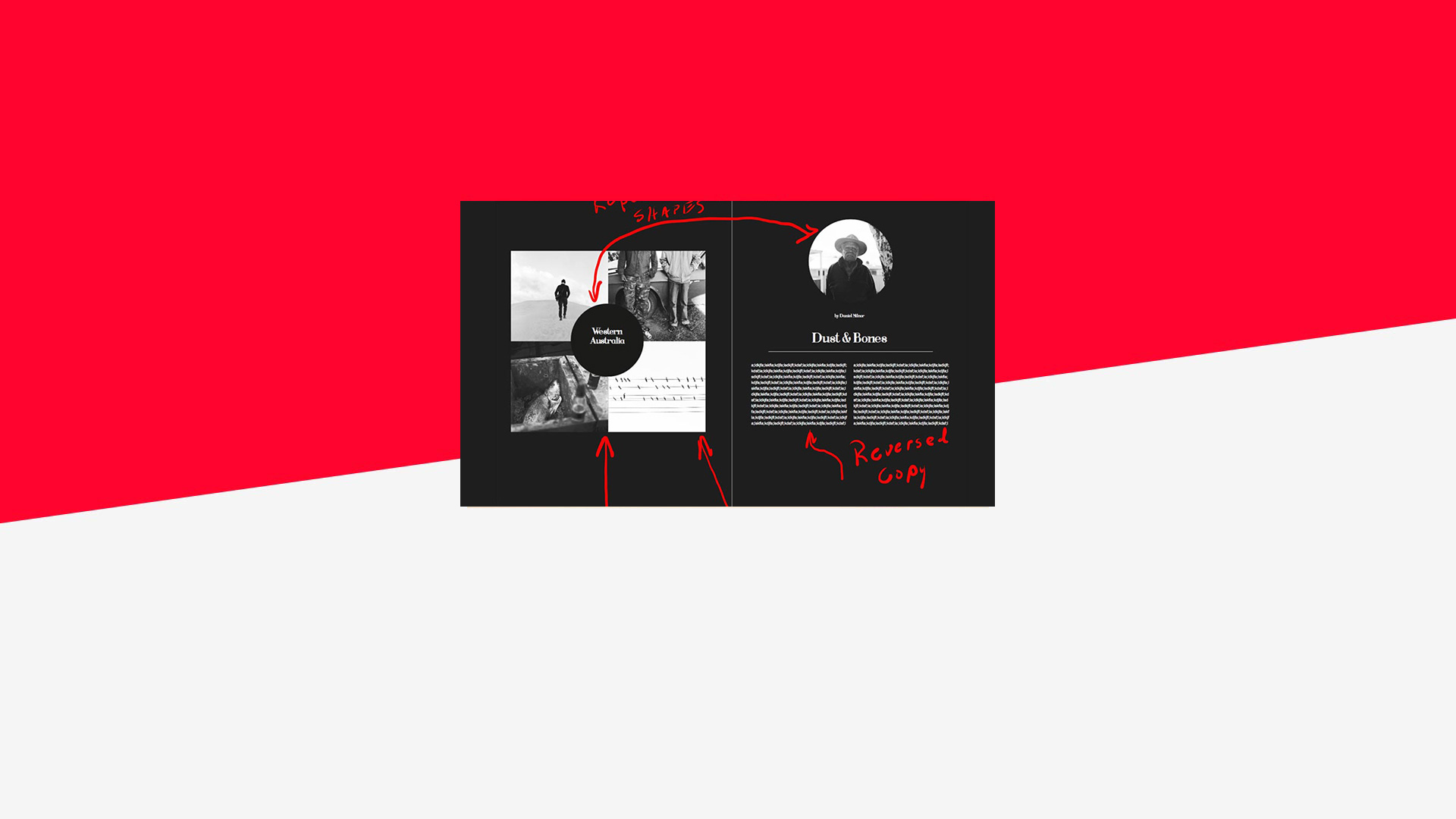
Black backgrounds have impact, but in both positive and negative ways. I used a black background here for one specific reason. Several of the images have white space near the borders of the image. Had I used a white background, these images would have bled into the background, and the reader would not know where the image stopped and the page background began. The black background works to contain the images.
I also used a circle for the main image, the portrait, and the title on the opposite page. Repeating shapes help with consistency. The images were shot square so I kept them in their natural state for the layout.

Layout 8.2
The elimination of the black background here immediately lightens the mood of the entire spread. I have images that bleed on the left-hand page, but the right-hand page contains a small border. If I were I to design this again I would full bleed the right-hand page as well to keep consistency.
I used a total of two fonts in this spread, one for the title and subtitle and one for the body copy.
I kept the black circle on the left as it does not cover any critical material and it helps to bind all four images together. Although shot square, the images are now being printed in a rectangular shape.

Layout 8.3
I’m often asked about combining color and black and white images in one spread or one book. Personally, I’m not a huge fan of doing this. Firstly, I’m not a believer in shooting everything in color and then converting select images to black and white. When you photograph in black and white, you have to see the world and the light in an entirely different way than when you shoot in color. I like to have more purpose and specificity when I work.
Secondly, the combination of color and black and white is asking a lot from the reader. You are asking them to deal with many visual, working parts.
However, the title “Dust and Bones,” directly relates to the color image, which details the unique Western Australia earth, and the copy, reversed in white, is still readable. In addition, the left-hand page is a counterbalance to the business of the right-hand page, reverting to all black and white with a small “About the Author” copy block.
***
Ready to get started on your own layouts? Our free desktop software, BookWright can help.
This post doesn't have any comment. Be the first one!