Book Layout & Design Ideas │Layout 6
This blog series is designed to provide some basic book design ideas for your books, magazines, or ebooks. The spreads you see here, and the added notes, are not meant to be reflections of perfect book design or book layout, only a baseline from which to begin your own book journey.
Layout 6
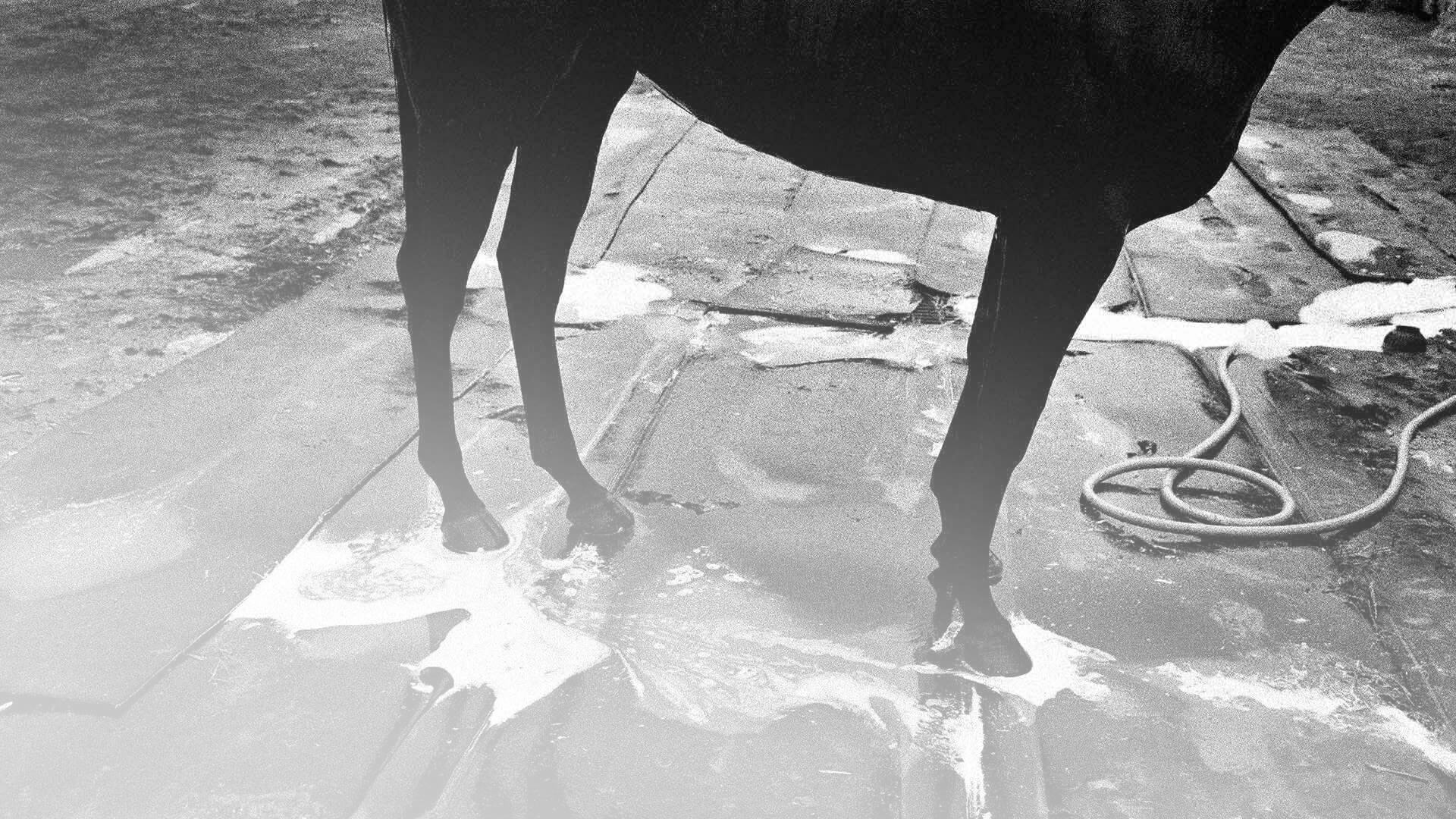
This image series was created during the races at Del Mar, California. The stable area comes alive during the early morning hours as the horses and trainers go about their business before the practice sessions begin. The series was made with both Leica and Fuji cameras. The films used were Kodak TRI-X and Kodak TMAX 3200.
Image 6.1

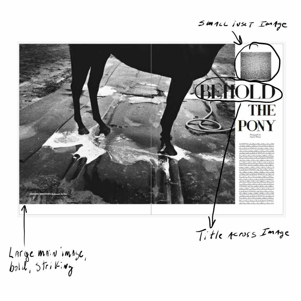
This is my favorite layout of the three. I like the big, bold, and simple main image, which dominates the entire spread. I love this photograph, so I feel it requires enough space to really be exploited to the fullest. There is a small, reversed out caption in the lower left corner, but it’s small enough so as not to detract from the image.
I like the small inlay photograph, which is a detail of the track surface. This small image fills space, but also provides crucial detail.
The copy is clean, simple, and small, but the title runs across the image. The title copy is justified to the right because it feels like the horse is leaning to the right. I wanted the text to feel the same. Although the image crosses the gutter, there is nothing lost.
Image 6.2

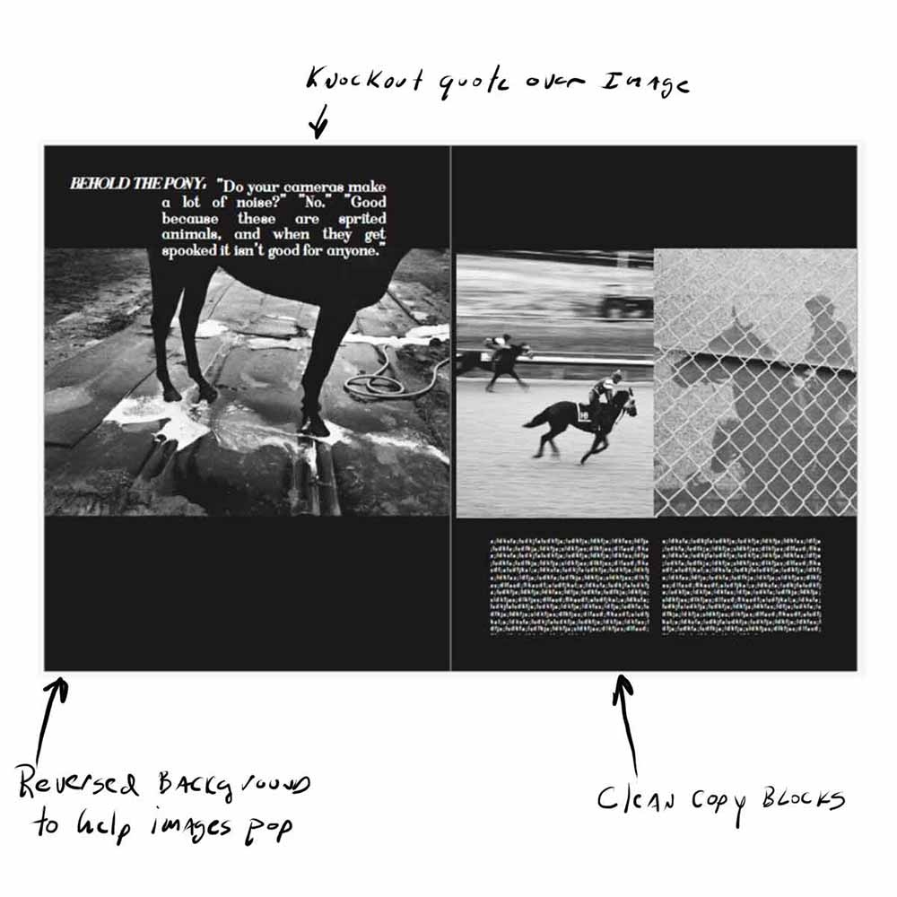
I rarely used color backgrounds in my books or magazines. However, the center image has very little detail near the top, so the black background actually helps the image stand out. I do like the drama of the black, and I was shooting on a cloudy day, so the overall feel of the images is somewhat dark.
The copy is reversed in white, as is the knockout quote. I ran this over the top of the image because the black horse blended naturally with the background. This spread is a little busy for my taste, but it was fun to try to blend so many parts.
Image 6.3

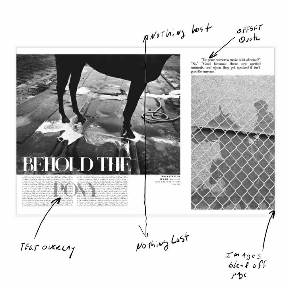
This spread is busy and feels somewhat disjointed on a flat display, but I think the design works on the actual page.
The images both bleed off on one side. The copy is clean and simple, and the reversed out title jumps off the page. I do like the overlay text with “Pony” in gray behind the black copy. Sure, it might be slightly difficult to read but I think the overall design is more important than perfect legibility.
The knockout quote stands out; simple, black on white. The caption is justified to the right. I feel this area is slightly disjointed, but justifying the text like this helps secure that area.
BookWright
Ready to get started on your own book design? Our free desktop software, BookWright can help. Learn more today!


This post doesn't have any comment. Be the first one!