Book Layout & Design Ideas │Layout 3
This blog series is designed to provide some basic book design ideas for your books, magazines, or ebooks. The spreads you see here, and the added notes, are not meant to be reflections of perfect book design or book layout, only a baseline from which to begin your own book journey.
Layout 3.1
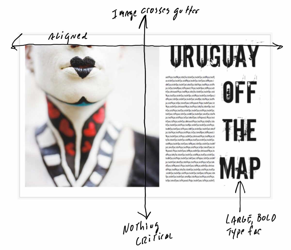
This is what I would call a more classic layout. I’m designing with a film-based, square image. I’ve placed the image across the gutter without losing any critical elements of the image. The typeface is bold, dramatic—impossible to miss. The photograph and the first line of the title are aligned. Simple, clean, and dramatic.
Layout 3.2
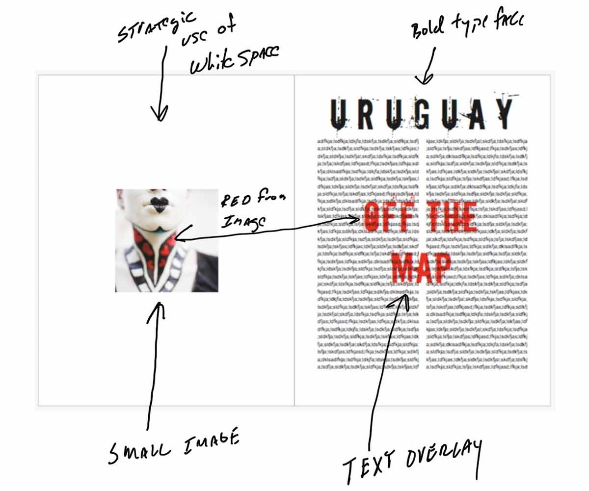
This is my favorite layout of the three. I’m purposely running the photograph small to take advantage of the white space. Using a photo this small allows for a somewhat quiet approach to the image, but I’m contrasting this with the bold use of copy on the right-hand page.
I’ve also created a text overlay by moving the red text backward, so the main text is still readable. The red is pulled from the neck area of the woman in the photograph.
Layout 3.3
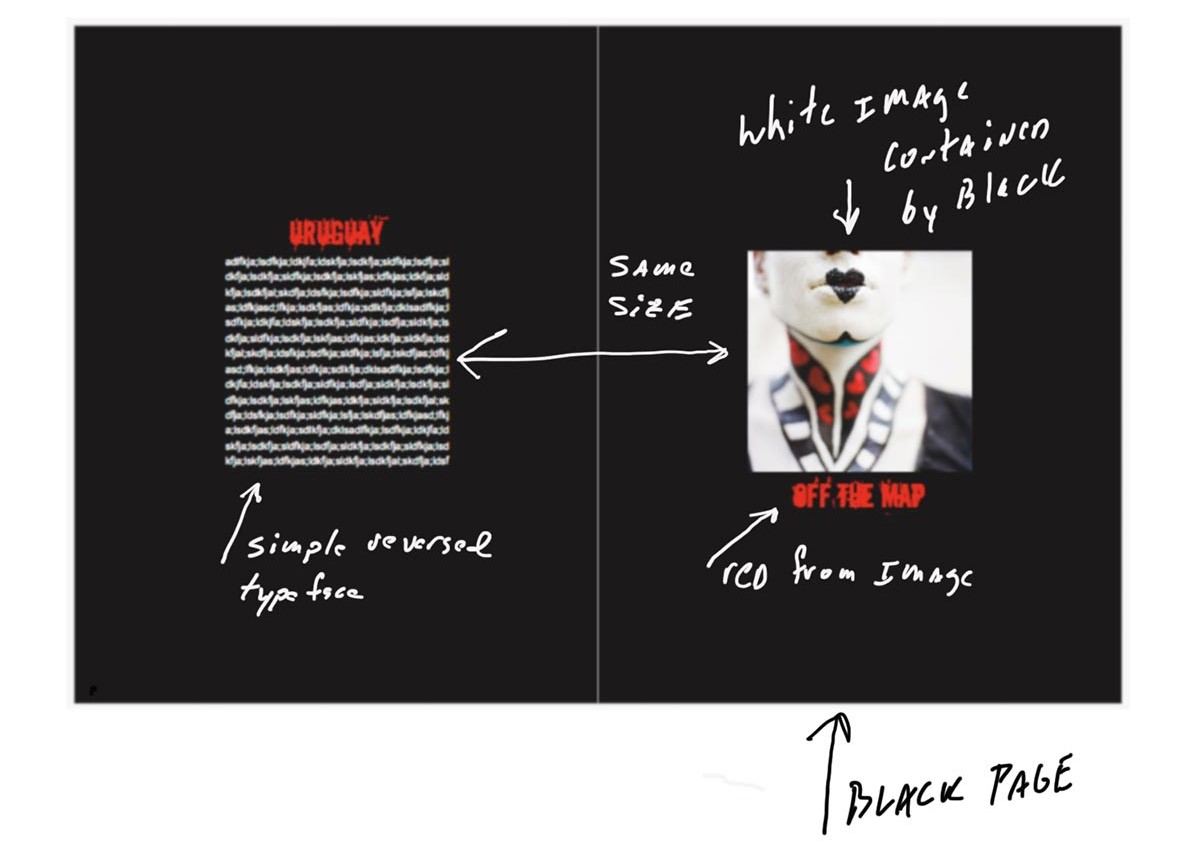
This is my least favorite spread, but I wanted to show the impact of changing the background color. So many people ask me about using black pages or other colored backgrounds. This is totally fine to do, but it will truly change the look and feel. I do like how the black helps contain the image, which does have a lot of white areas along the borders.
The text is reversed out in white, and again I pulled the red from the image and used that for the titles. I do think this spread feels a bit on the “heavy” side.
What are your top tips when it comes to book design? Share your comments, questions, and ideas on these layouts below. Want a starting point for creating your own layouts? Get one of Blurb’s layout templates that you can completely customize.

This post doesn't have any comment. Be the first one!