5 tips for a standout book cover
The cover is your book’s first impression. It’s time to help your visual book introduce itself. But how do you make your cover stand out on the shelf?
1. Say it without words

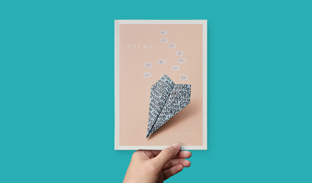
A cover image should quickly convey the essence of a book—and it should be striking. Using an Imagewrap allows you to tell the story of your book with one stunning, seamless image. Is there an object or recurring character that conveys the idea of the book? Is there a photo in your book that illustrates your book’s theme and is eye-catching?
2. Pare it back

Keep it simple. Give your cover image and title room enough to make a powerful impact. White space is your friend. Emptiness could seem odd as a creator since there is always a desire to add more, but simplicity will help bring focus to your work.
Remove backgrounds if needed, and don’t be afraid to mix different visuals, such as combining photography and illustrations. People don’t need to read everything that your book is about—if your cover gets their attention, they’ll pick it up to learn more.
3. Use contrast

Whether it’s through color or size, create a contrast between the image and text so both will catch the eye. If you have a dark background, white text and a light foreground will work nicely. That opposition will help your composition create a focal point.
Be aware that contrast does not only refer to opposite colors. You can find contrast amongst monotone palettes as long as your colors do not share the same intensity. A good way to test if your colors are working together is to turn your composition to black and white in your preferred image editor (such as Photoshop) and see if the contrast holds.
4. Create leading lines

Use the natural shapes and lines in your image to help place your text. This guides the reader’s eye and points to the specific meaning and message in your image.
Basic shapes can make your composition stand out and also provide the illusion of movement. If you are afraid of shapes, using grids can be useful. Some of our favorite grids to use are the fibonacci grid, the vertical rhythm grid, and the multi-column grid (we prefer to set 16 columns, but the choice is yours).
5. Choose the final finish

Pick a cover type that suits the content. Formal, archival content might be at home in cloth and a dust jacket, while short stories and poems might want the portability of a softcover paperback. If you want to upgrade your book and will be placing a large order, you can explore foil stamping, embossing, and debossing.
Ready to make a book? Get started!


This post doesn't have any comment. Be the first one!