
How to design a book cover: professional tips for success
Creating a unique and eye-catching book cover is essential for any author or creator looking to self-publish their work. Despite the overused cliché, “never judge a book by its cover,” a well-designed cover makes all the difference in winning readers’ attention and selling your book.
Since your book will definitely be judged by its cover, it’s absolutely crucial that you make a compelling first impression. A strong visual impact entices people to pick up your book and helps communicate its tone and content.
While you can explore limitless creativity when designing a book cover, there are also fundamental best practices you shouldn’t overlook. So before you open Photoshop, InDesign, or Canva, let’s first unpack professional tips to ensure it’s a success.
Three things you must know about book covers
There’s no doubt that you want your book to pop among other titles in your genre. Doing so requires a striking cover design that dazzles target readers and evokes a sense of curiosity and interest.
Before getting to the how-to tips behind your book cover design, there are a few hard and fast realities to respect. But don’t worry. Designing isn’t necessarily a project to pursue alone. Sure, you can take the creative lead, but it’s vital to research beforehand and recruit the right help where needed.
Book covers: we all judge them
According to one survey, 79% of people claim that a book’s cover influenced their decision to purchase it. While that may put pressure on you as a creator, the fact that most of us judge a book by its cover can be an opportunity to leverage.
We, as humans, are biologically wired to absorb visual elements to determine our likes and dislikes. Images, colors, and designs immediately trigger our brains. We are automatically drawn to beautiful books and must consciously dismiss poorly-designed books to give them a second chance. That’s a second chance you don’t want to count on.
There’s no debating that people will judge your book cover within seconds of seeing it. The key is harnessing that inevitable judgment as a pivotal moment to grab readers’ attention and lure them into reading your book.
Case study: Portals
The same cover design study above found that most respondents believe covers are the “artistic representation” of a book and should accurately portray the book’s genre, tone, and content. Jeff Quinn uses everything at his disposal—from title to white space to color palate to art choice—so viewers immediately know what is inside, despite its minimalist approach.
Guess the contents of this book based solely on the cover.
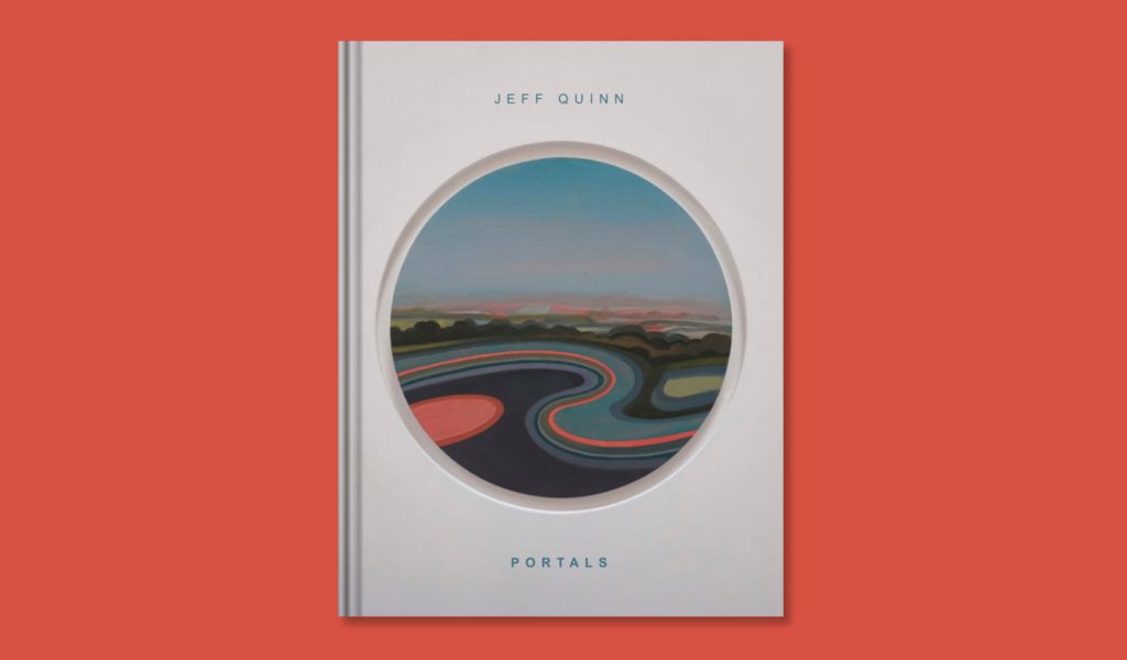
Ready for the answer? Quinn’s book PORTALS is his exhibition catalog for his artwork. It blends trippy visuals and calming colors to draw readers into other dimensions. From cover to back page, you’ll encounter windows to new worlds.
Hiring a book cover designer pays dividends
There’s a reason why most self-publishers recruit the help of an experienced book cover designer. Most creators are not designers. And there are plenty of talented professionals who are.
We’re not saying you shouldn’t design your book cover. But if you’re serious about creating a high-quality product that stands out in your book genre, investing in an experienced designer helps to ensure that your vision is accurately and professionally realized.
Creative talent pools and freelance directories like Reedsy, Upwork, 99designs, and Guru are good places to start. Depending on the artist’s rates, you can expect to pay between $250 and $800+ for a professionally-designed book cover. But this investment can yield high returns if you aim to publish a successful finished product that stands out in a bookstore.
It’s smart to conduct market research
Creating an original cover that resonates with your target audience requires market research within your specific book genre. This includes analyzing bestselling books in similar categories and understanding current trends and reader preferences.
By researching the market, you gain awareness of what attracts potential customers. This invaluable knowledge can fuel inspiration for your cover. You can start by:
- Browsing through top-selling books on platforms like Amazon or Goodreads within your chosen genre. Take note of common themes or styles across various covers.
- Visiting bookstores or libraries to observe physical copies of popular titles, paying attention to the overall design, color schemes, and typography choices that stand out on shelves.
- Researching book cover design trends to understand what’s hot right now. Some of the most popular trends of 2023 include bold typography and loud maximalism, nature-inspired photography, parametric patterns, and conceptual cover sleeves.
Case study: Nudes, Nudes, Nudes
Aesthetics change from culture to culture and century to century. A compelling book cover from the 1800s in India was significantly different than what’s hot in 2023 in the United States. Beautiful book covers change from year to year, even! Look at books with multiple editions—many have a totally different style than their first print.
Edgar Alanis’s 2022 self-published book Nudes, Nudes, Nudes is a masterclass in what’s trending today.
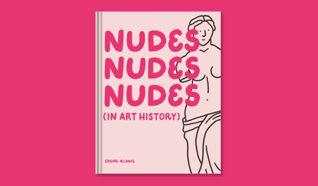
This cover is a bold example of incorporating skin-toned color choices, bold yet playful typography, and a provoking maximalist composition. It’s obvious he incorporated research and trends into his cover design—helping his book appeal to readers in his quirky, sardonic target market.
Tips for designing a professional book cover
Whether you’re keen on working with an artist or plan to take a DIY approach, you’re the creative director behind your book cover’s design. So how do you combine all these elements to bring your book cover concept to life?
These are the steps the professionals take when conceptualizing a book cover—you can take them too.
Gather inspiration for your book cover design
As part of your market research, exploring other book covers offers a wealth of creative inspiration. Browse books on Amazon Best Sellers or skim websites like Book Cover Archive. Expose yourself to hundreds of professional book covers and see what grabs your attention. Analyze the elements that make specific covers eye-catching and memorable while conveying their intended message.
Take this exercise a step further and check out covers from popular books in your genre. What do you like or dislike about related books in your space? How can you differentiate your books from others recently published?
As you take notes, remember this isn’t about replicating what others are doing. Instead, it’s about creative positioning and imagining a cover that will stand out on the shelf.
Outline your book’s central themes
A beautifully-designed book cover provides potential readers a glimpse of its contents while leaving them wanting more. Identify and outline your book’s key themes or motifs to inform your cover design concept. The outcome should connect the visuals on the cover to what lies within its pages.
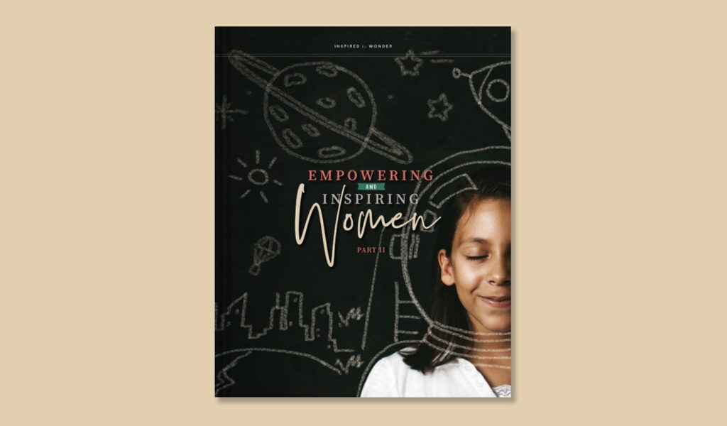
Let’s look at an example. The central themes of Empowering and Inspiring Women Part 2 focus on creativity, resilience, inspiration, empowerment, and perseverance. The book emphasizes the role and rights of children, particularly the journey of girls blossoming into leaders. However, the intended audience is wide, speaking to parents, educators, and leaders who support the value of women in their communities.
These themes served as guiding principles for a compelling cover for the book—from the choice of bold black and red colors, inspiring and joyful photography, and the mix of powerful and feminine typography.
Now it’s your turn. Based on your book’s core themes, what’s the feeling or mood you want to evoke? What message do you wish to convey? What style of imagery might capture your book’s essence?
Outlining your book’s central themes informs your color, imagery, design, and copy choices. These combined elements offer prospective readers a clear and inspired idea of what your book is about. This process can help jump-start your book cover brief.
Assemble a book cover brief
Like the creative brief for a logo or the content brief of an article, your book cover brief is a helpful guidepost that instructs the design process. In essence, a book cover brief documents the basic information about your book and what boxes the cover should check.
Your book cover brief can take many shapes. But a few key elements will make your brief most helpful to your designer—whether your designer is you or someone else!
Here’s what you need to include:
- The exact dimensions and cover details, like cover type, book type, and if foil or other unique design elements should be used. Don’t forget to include where your book’s barcode will live!*
- Design suggestions like brand identity elements, mood board inspiration, color palate, and details for the book’s overarching visual appeal.
- The specific copy you want to include, like your name, book title, subtitle, tagline, reviews, and other key text. Think about your spine, flaps, and back cover—you might want to include awards and an author bio.
- A summary of the book’s genre, target audience, and target market demographics.
- Background context, like a book synopsis or short description of the book, its core themes, and any main characters.
- Your deadline, budget, and dates for feedback or check-ins.
- Examples of book covers you love and dislike—plus an explanation of the why behind each.
This brief is an essential communication tool when working with a designer. But it can also provide a framework to help keep your cover design project organized if you’re building your own.
Consider visual hierarchy
Visual hierarchy refers to how our eyes perceive different elements based on size, color, contrast, and alignment, allowing us to process information more efficiently. When designing your book cover, sketching each element’s general size and location can be helpful.
Apply this principle when designing a professional book cover by asking yourself a few questions:
- What’s most important? Decide how to prioritize the essential components like title, author name, and imagery.
- Where do you want your reader’s eyes to go next? Use this to create balance through symmetry or asymmetry—depending on the desired mood or tone.
- How can you use color and white space to make what’s critical pop? Try contrast to make critical elements stand out from the background.
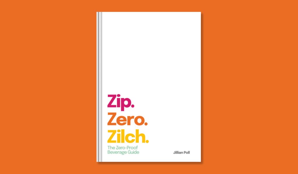
Let’s look at a book that makes the focal point very easy to discover. Jillian Poll’s liberal use of white space in the top half of the book cover of Zip. Zero. Zilch. speaks volumes about the book’s premise while balancing color contrast, alignment, and asymmetry. It’s a great example of a book cover design that does more with less. Plus, in a sea of recipe books featuring food or beverage photography, Poll’s book stands out!
Deciding upon your visual hierarchy and sketching out your cover’s balance, contrast, and genre-specific elements enables you to craft an eye-catching book cover that effectively conveys your story’s essence. Stay true to your genre and personal aesthetic while experimenting with design elements, as this helps establish a cohesive visual identity for your work.
Select your fonts and colors
A crucial aspect of creating an attractive and readable book cover is selecting fonts and colors that complement each other while also fitting with your book’s overall theme or mood. When making these choices, you’ll want to keep legibility in mind. After all, what good is text you can’t read when deciding whether to buy a book?
When making a color palate, consider contrast as well—online contrast checkers allow you to make your cover accessible to everyone, especially those with visual disabilities.
Choose your fonts based on readability and style
The right font can significantly impact how your book cover resonates. It should be easily readable, even in smaller sizes like thumbnails, while still reflecting the tone of your content.
When selecting a font, consider both print and digital compatibility and your book’s genre. Some popular options include serif fonts for traditional genres like historical fiction or non-fiction books, sans-serif fonts for modern or minimalist designs, script-style typefaces for romance novels, and more.

Here’s an example. Michael Johnson’s Success! makes bold use of color while capturing the book’s mood with a clever illustration and the classic Blambot-style comic font for the author and subtitle. You immediately understand that this is a comic book, just with the font selection.
Note his use of two fonts—one in all caps for his name and subtitle in different sizes and another bold, hand-drawn font that makes the title stand out and matches the illustration.
You’ll find many cover designs that blend two contrasting fonts. More than two, and your book cover can feel cluttered. But relying on a single font when you have a lot of text can make a book feel too simple.
Evoke emotion with your color scheme
Colors play a vital role in setting the mood of your book cover design. Different hues can evoke various emotions, so choosing a color scheme that aligns with your story’s themes helps create an impactful visual representation. For example:
- Mystery/thriller: Darker shades like black, gray, and deep reds might be suitable.
- Romance: Soft pastels or warm tones convey feelings of love and passion.
- Fantasy/sci-fi: Vibrant colors or metallic accents add excitement to fantastical worlds.
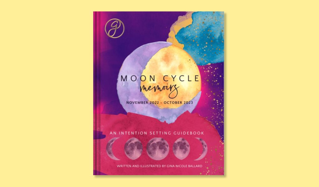
Take Gina Nicole Ballard’s typography and color palette. Her book, Moon Cycle Memoirs, clearly states the book’s purpose while using bright and dreamy watercolor blends and a creative mix of fonts. The first thing that catches your eye is the stunning moon illustration in deep purples, reds, and a splash of yellow. That yellow splash focuses readers squarely on the title.
Ballard’s title is placed at the center in two fonts—a legible sans-serif and an imaginative handwriting pick. She uses that same legible font in varying sizes for the rest of the text on her front cover, which helps it feel cohesive.
Beyond the primary colors used in your design, paying attention to contrast is also essential. For instance, choose lighter text colors for readability if your cover has a dark background image. Ballard has done just that—alternating between dark font on the yellow part of her design and lighter font on the deep red background.
Make your title stand out
An attention-grabbing title can make all the difference between someone picking up your book or passing it by. Choose typography that emphasizes key words without overwhelming potential readers with a cluttered design.
Increase your font size
You’ve already chosen the typography you want for your cover; now it’s time to play with it. Bumping your title’s size up all the way helps your cover stand out from a distance. Try playing with bold, italics, and underlining, too. What allows your title to jump off the shelf?
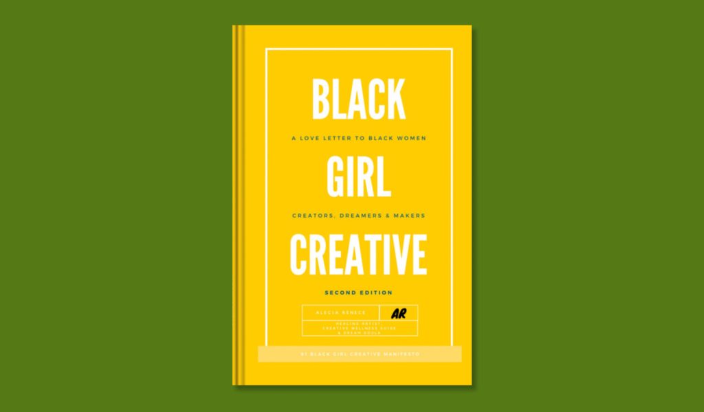
Alecia Renece’s Black Girl Creative Manifesto is a perfect example. She picked an authoritative, clear title font and increased its size to nearly as high as possible. She bolded and centered her title and interspersed her book’s subtitle between each word in a smaller, dark, and unbolded font. It’s a great example of using size to emphasize important words and capture attention without sacrificing readability.
Let your title breathe
Beyond choosing an appropriate font style, balancing text size with other elements on the cover is essential. White space is a great way to ensure your text is easy to read and stands out from its background.
As you continue designing your cover, keep track of how much text will fit in each space—this will help the design look balanced and offer plenty of breathing room for your readers. Return to your visual hierarchy plan as you consider the negative space around your title. Where are you drawing the eye?

A great example of text and spatial balance is Juan Camillo Garza’s I’m Here. Garza gives a clear sense of the book’s serious mood by choosing a hollow, black-and-white font that compliments his illustration. He then pairs it with a generous amount of negative space, which gives the title and his name extra emphasis.
Here’s what to keep in mind when thinking about your title.
- Limit the text. Keep in mind that too much text can be overwhelming for readers. When in doubt, opt for fewer words and more visual elements. If your title is long, cut your subtitle down.
- Play with your visual hierarchy. Arrange each element on your cover according to its importance. If your title is most important, make it the biggest part of your design. If your name draws attention, let it take up more space than a photo.
- Add lots of negative space. Add breathing room around each text element so nothing feels cramped or overcrowded. Providing adequate spacing between lines of text helps improve legibility while creating a more visually appealing design.
Remember your book’s spine and back cover
It can be easy to overlook your spine and back cover details and focus solely on your front cover. But these areas provide valuable real estate opportunities for creator bios, endorsements and reviews from industry professionals, book summaries, and other info that can entice readers to crack a book open.
Design an engaging spine
The spine of your book is often the first thing potential readers see when browsing a bookstore shelf. So make it count! Your spine should be visually appealing while still providing essential information about your book.
Here’s what to remember.
- Select a legible font. Choose a clear typeface that matches the style used on your front cover for consistency. Make the size as big as possible to read from a distance.
- Place your title front and center. Ensure your title and subtitle are placed prominently on the spine and easily readable—even from afar. (This is so important we said it twice.)
- Add your name. While your title is the most important thing to include, readers want to know who you are, too.
- Avoid excessive text or images. Keep it simple! Too much clutter can make your spine hard to read and less aesthetically pleasing.
- Use contrasting colors. Make sure your font’s color stands out against your spine’s background.
Effectively use your back cover space
Your book’s back cover design is crucial in convincing potential readers to purchase your book after they’ve picked it up off the shelf. It also has the most space for text and additional information—so there’s a lot to consider.
While most of these elements are optional, there are some best practices for effectively using your back cover.
- Create an enticing blurb or synopsis. Summarize what makes your story unique without giving away any spoilers. Your book’s blurb should pique interest while leaving them wanting more.
- Include your bio and photo. A brief introduction to the author and an on-brand photograph help readers connect with you on a personal level.
- Add endorsements or reviews. If your book has received praise from industry professionals or other published creators, include these quotes as social proof of your work’s quality. You can even add reviews from Goodreads or Amazon if you already have a book out.
- Mention awards or other books. If your book is affiliated with a prestigious award or if you’ve written other books, don’t forget to mention those, too! It establishes credibility and allows readers who haven’t heard of you to take a chance.
- Incorporate relevant visuals. Use images that complement the front cover design and provide additional context for potential buyers.
- Remember your barcode and ISBN. Many printers have a specific location your barcode and ISBN must be.* Keep it in mind as you design your back cover.
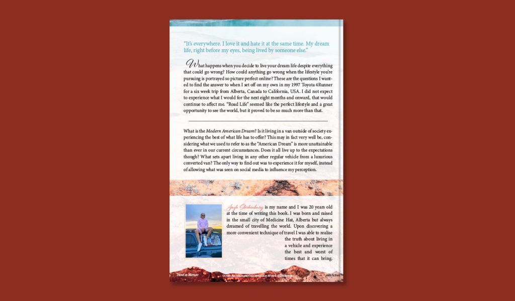
Peek at an example. For the back cover of The Modern American Dream, Jayk Sterkenburg stays on brand with paradigm-shifting prompts that flow with the book’s title and premise, along with personalized touches about his travel aspirations.
A pull quote is at the top of his back cover, so readers get a sense of his writing style. From there, Sterkenburg goes into a blurb with many thought-provoking questions. Finally, he ends with a photo and author bio—plus a few design details that give you a sense of the memoir’s setting.
Taking the time to design your spine and back cover thoughtfully increases your book’s chances of being picked up and bought by readers browsing the shelves. Give yourself plenty of time to play with your design.
Get feedback
Whether you’ve designed your book cover yourself or hired an expert, requesting feedback on the final design is critical. Ask for honest opinions from acquaintances, peers, and industry professionals. If you’re unsure where to turn, join online forums and ask fellow self-publishers for their opinion and guidance! The more opinions, the better.
Listen to every suggestion and incorporate any relevant feedback into your final design before getting ready to publish. From there, you’ll want to print a single proof and double-check that your cover (and book interior) are picture-perfect before listing your book in bookstores.
Get started today
Creating an eye-catching book cover is essential for any self-publisher who wants to sell their work. By leveraging the power of research and thoughtful design choices on your front and back cover, you can design a book that will draw in readers browsing store shelves.
After reading this guide, we hope you feel more confident about designing your book cover. So what are you waiting for? Make a stunning design that will help launch your book into the world.
***
Blurb is a self-publishing platform allowing you to create, print, promote, and sell your books. If you’re ready to put these tips into action, try BookWright today. This free-to-download book design tool makes it possible to design stunning covers without graphic design experience.
*Note: If printing a Blurb trade book, your barcode and ISBN will be automatically placed during production and can’t be moved or omitted.